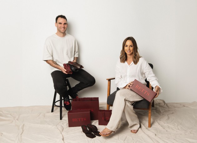
Australian footwear brand Betts has begun overhauling its channels and collections this year to continue its focus on sustained growth.
In its 133rd year, Betts has unveiled its new Spring/Summer 26 collection, which officially launched via its refreshed website this month, and will be followed by a revamped in-store experience rolling out nationwide from 2026. Other key changes to branding include new packaging.
Betts has over 70 stores across Australia.
This is part of an overall rebranding exercise led by creative agency Willow & Blake, which aims to shed the school shoe associations and refocus on Betts’ maturity and growth as a fashion brand.
Founded in 1892, Betts remains a family-owned business. The brand is currently led by CEO Michael Breckler, a fifth-generation family member, and Betts' newest shareholder and chief marketing officer (CMO) at large, Jessica Hatzis. Hatzis is the former owner of wellness brand Frank Body.
Within the new strategy for Betts, this includes the retiring of sub-labels, streamlining the range to a consolidated offering of women’s shoes and bringing Betts' Australian heritage story to the forefront.
“I spent months in the data, analysing every move of the brand and the Betts customer to identify our pathway forward,” Hatzis said. “It was a big and bold decision to let go of certain aspects of the brand and product offering, but ultimately, one made at the intersection of commercial thinking and the respect for the customers' needs, as many big branding moves are.
“It’s one I believe will be the lever for a new era of sustained growth.”
The new brand identity is anchored by the creative platform ‘Classic with a twist.’ According to Betts, this platform represents its commitment to “maintaining the classic elegance of our brand while infusing it with a modern twist.
The new identity includes a new wordmark, an oxblood red palette and a new icon.
“Our new strategic direction is about respecting where we’ve come from while defining who we are today,” Breckler said. “For a family business to survive this long, evolving with the times is essential.
“We’re focused on creating collections that resonate with women who don’t compromise on style, quality or price.”
The brand's archives served as creative inspiration for Willow & Blake. The firm’s creative director Bri Nixon said this included its classic, Italian typeface and the oxblood red colourway.
“We’ve struck the balance of familiarity and modernity in every element, from copy that features idioms with a twist to campaign imagery that feels recognisably fashion-forward, but always with an unexpected element.”


